The St. Croix National Scenic Riverway:
One of the National Park Service’s often overlooked destinations
By Matthew Kollmer
Final Project Part 3.1
 Image 1: “Evening Light”
Creator: Donyal Eret
Credit: NPS/Eret
Source: NPS.gov
License: Public Domain
Introduction
The St. Croix National Scenic Riverway is one of the best outdoor destinations in the Midwest.
Situated along the borders of Minnesota and Wisconsin, it is managed by the National Park
Service (NPS) as a designated National Scenic Riverway. With hundreds of miles of pristine
river shoreline and rocky bluffs, the St. Croix River appeals to multitudes of nature lovers
and visitors every year.
It’s only been recently, however, that rates of visitors have increased. In this visualization-driven
exploration of NPS data on the St. Croix River, we’ll discover exactly how much the St. Croix
River has grown in popularity in recent years.
Data used in this exploration is drawn from various online sources. All of the data is created
by U.S. Government agencies, including NPS and the U.S. Census Bureau. As government-funded
data, it is part of the public domain. More information on licensing info can be found on
the NPS Disclaimer page.
St. Croix River & Mississippi River visitor data is drawn from the NPS online data GUI.
This GUI requires users to download smaller portions of the NPS’s larger datasets. Those
downloaded portions are hosted on GitHub with appropriate links for each visualization below.
Geospatial data is drawn from the NPS’s online geospatial datasets, the NPS park centroid dataset,
and the U.S. Census Bureau’s online state map data. These datasets are quite large,
so I extracted the necessary geospatial data and created new files to be hosted on GitHub.
Those files are linked underneath their corresponding visualizations and in the Sources section
below.
St. Croix River Visitor Data
The primary dataset is comprised of the NPS’s St. Croix River visitor data. This dataset
contains yearly and monthly visitor rates from 1979 to 2022. There are several ways to visualize
this data. Below I’ve provided figures 1, 2, and 3 which all help to elucidate this dataset.
Figure 1: Interactive Barplot
Figure 1: Total St. Croix River Visitors by Year
Creator: Matthew Kollmer
Description:
Figure 1 is an interactive barplot. The x axis shows different years in the data (1979-2022)
and the y axis shows the total number of visitors for the given year. This visualization allows
users to compare year-to-year visitor totals more easily. But that’s not all––there is
also a red line through the visualization which represents the mean total of visitors. This
mean total aspect of the visualization is interactive. Users can click and drag a portion of
the barplot and the red line will move according to the corresponding mean totals of the selected
portion.
This allows users to get a better sense of the increases and decreases in visitor rates over
the years. This visualization makes clear that visitor rates have fluctuated in recent years,
but overall they have trended upwards since 2013. It looks like the St. Croix River is growing
in popularity!
Click here for the data used in this visualization.
Click here for the code used in this visualization.
Figure 2: Line Chart
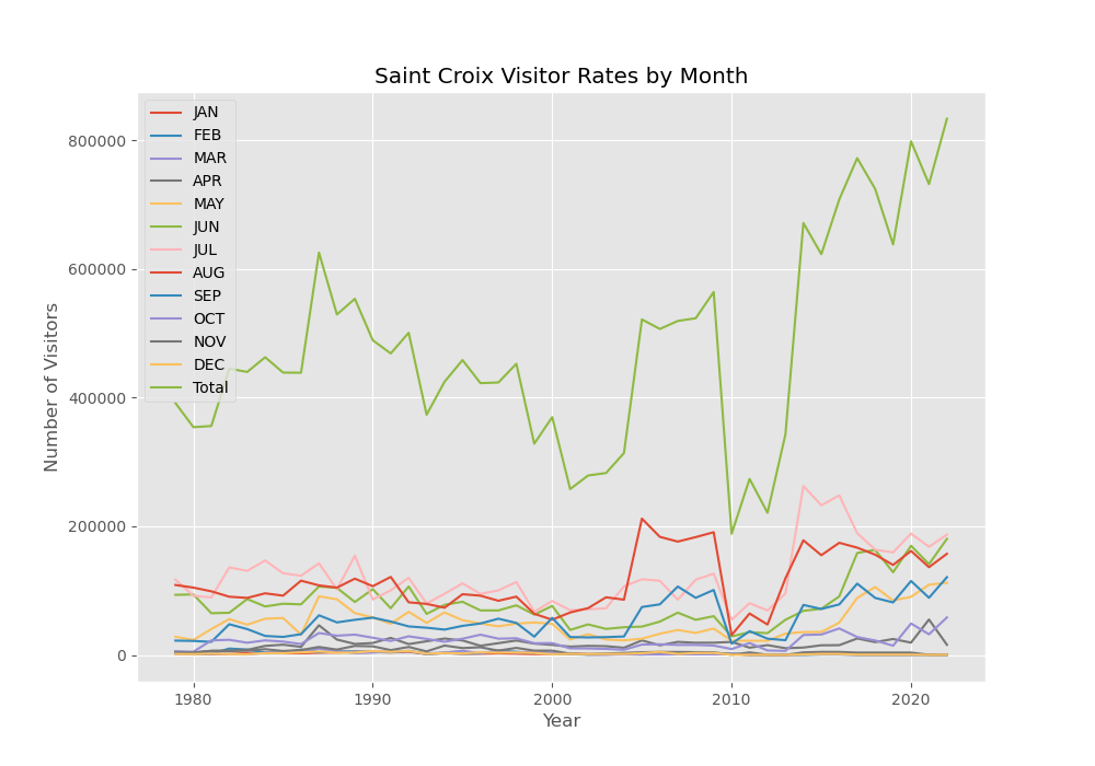 Figure 2: Saint Croix Visitor Rates by Month
Creator: Matthew Kollmer
Description:
Figure 2 is a line chart utilizing the same St. Croix River visitor data. On the x axis, a
time series by year is represented. On the y axis, the total numbers of visitors are represented.
This visualization is similar to Figure 1, but it also includes color-coded lines for visitor
rates per month as well as a line for the total.
With Figure 2, users can study monthly and yearly trends of visitor rates. For example, the months with the greatest increases in visitors over the last decade include May, June, July, and August. It seems the St. Croix River has become more popular over the spring and summer.
Click here for the data used in this visualization.
Click here for the code used in this visualization.
Figure 3: Grid Heat Map
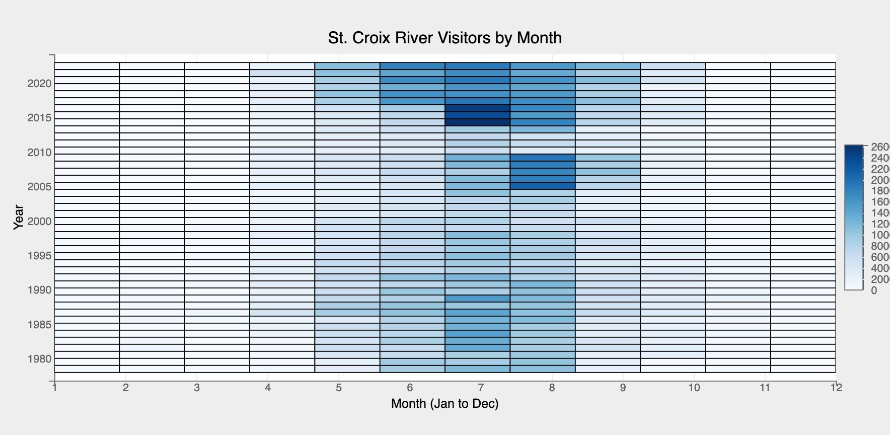 Figure 3: Grid Heat Map of Visitor Rates by Month
Creator: Matthew Kollmer
Description:
Figure 3 provides another way of visualizing this month-to-month increase in visitor rates. It’s a grid heat map with months represented on the x axis and years represented on the y axis. Color represents the visitor rates per month-year index, with darker blues indicating higher visitor numbers while white represents far fewer visitors. As you can see, it seems that summer visitor rates have always been higher, but they are much higher more recently.
So, if you want to avoid the crowds, maybe visit the St. Croix River in the winter! But bring
your coat–it’s cold in December!
Click here for the data used in this visualization.
Click here for the code used in this visualization.
Figure 4: Geographic Map
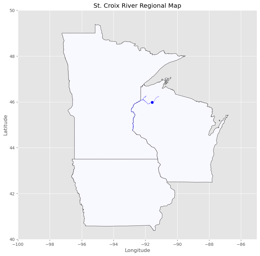 Figure 4: St. Croix River Regional Map
Creator: Matthew Kollmer
Description:
Now you might be wondering: where exactly is the St. Croix National Scenic Riverway? Well,
Figure 4 provides a geospatial image to help orient users to the St. Croix River’s location.
This map presents the nearest U.S. states to the St. Croix River–Iowa, Wisconsin, and Minnesota.
The St. Croix River, along with its longitudinal and latitudinal centroid, are colored blue.
The river runs along the borders of Minnesota and Wisconsin. It’s a long stretch of territory
accessible from the Minneapolis/St. Paul area and western Wisconsin.
The Data files used in this visualization include:
Click here for the code used in this visualization.
St. Croix River Visitor Type Data
But if the St. Croix River has grown in popularity over the last decade, we might want to
know exactly why people are visiting, right? Thankfully, the NPS also keeps track of visitor
types. This contextual dataset provides yearly rates for particular visitor types, including
Recreation Visitors, Non-Recreation Visitors, Backcountry Campers, and Total Overnight Stays.
Figure 5: Line Chart
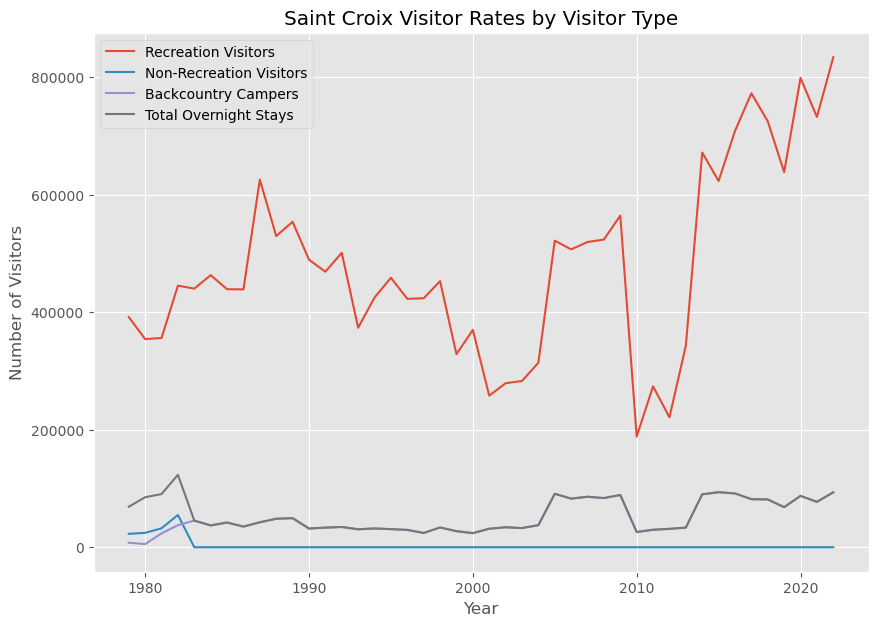 Figure 5: Saint Croix Visitor Rates by Visitor Type
Creator: Matthew Kollmer
Description:
Figure 5 is a line chart with years represented on the x axis and numbers of visitors on the
y axis. The lines are color-coded by visitor types, and they increase/decrease along the x axis
based on the corresponding visitor numbers for the given year. This visualization makes clear
that the vast majority of visitors are Recreation Visitors. It also makes clear that overnight
stays are relatively uncommon in comparison to general Recreation Visitors.
Click here for the data used in this visualization.
Click here for the code used in this visualization.
Figure 6: Interactive Barplot
Figure 6: St. Croix River Overnight Stays by Year
Creator: Matthew Kollmer
Description:
Figure 6 is an interactive barplot which provides more insight into overnight stays. The x axis
shows year-by-year bars extending up to their corresponding total visitor numbers of overnight
stays on the y axis. This allows users to see more clearly how many overnight visitors there were
each year. If you need to know the exact number of overnight stays on a given year, you can also
hover over the corresponding bar, and the total overnight stays for that year will be shown.
Click here for the data used in this visualization.
Click here for the code used in this visualization.
Mississippi National River & Recreation Area Data
As another way to contextualize the St. Croix River visitor data, I’ve also investigated a
similar NPS destination: the Mississippi National River & Recreation Area (Mississippi NRRA).
It’s also a scenic riverway, and it also happens to be the nearest NPS destination to the St.
Croix River. The Mississippi NRRA dataset provides visitor rates by month and year between
2011 to 2022.
Figure 7: Interactive Barplot
Figure 7: Total Mississippi NRRA Visitors by Year
Creator: Matthew Kollmer
Description:
Figure 7 is an interactive barplot with years on the x axis and total visitor numbers on the
y axis. Just like Figure 1, it has an interactive component: a red line representing the mean
total visitors that can change based on a user’s click-and-drag selection.
A few things become clear when we compare Figures 1 and 7. Firstly, the St. Croix River data
extends further back in time, with years going back to 1979, whereas the Mississippi NRRA only
extends to 2011. Secondly, it seems the St. Croix River is more popular with visitor rates
averaging around 480,000 people per year over the course of its data while the Mississippi
NRRA averages less than 250,000. Finally, both plots show a trend toward more visitors over the
years, but the upward trend in the St. Croix data is far more consistent. The Mississippi NRRA
seems to have dropped in popularity from 2020 to today, with its peak years just prior (2017-2019).
Click here for the data used in this visualization.
Click here for the code used in this visualization.
Figure 8: Grid Heat Map
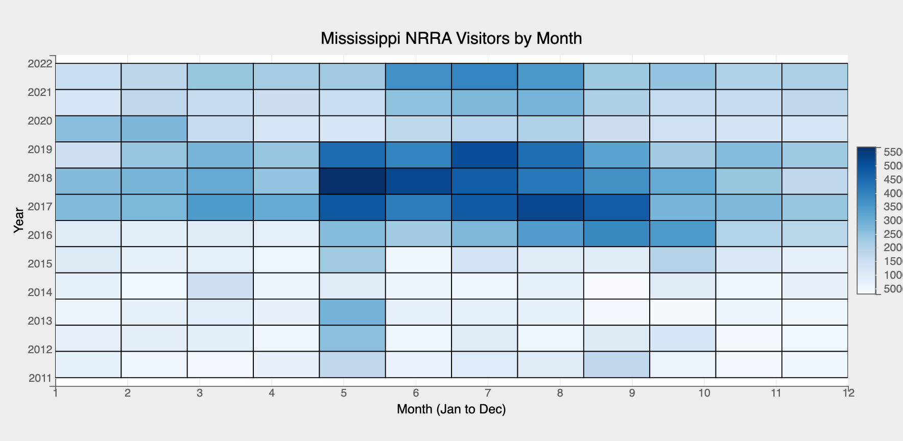 Figure 8: Grid Heat Map of Mississippi Visitor Rates by Month
Creator: Matthew Kollmer
Description:
Figure 8 provides further comparisons. It’s a grid heat map of the Mississippi NRRA data with
months along the x axis and years along the y axis. When we compare it to Figure 3, we see that
visitor rates per month increase during spring and summer months for both riverways. That makes
sense! Those warmer months provide lots of recreational activities along these rivers that run
through some cold parts of the U.S., so it’s no wonder visitor rates increase at those times.
Click here for the data used in this visualization.
Click here for the code used in this visualization.
Figure 9: Geographic Map
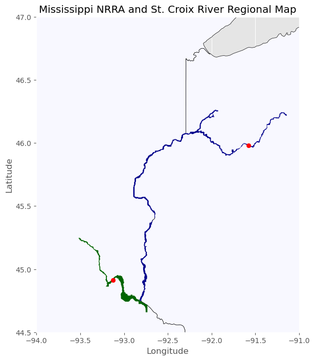 Figure 9: Mississippi NRRA and St. Croix River Regional Map
Creator: Matthew Kollmer
Description:
But where exactly is the Mississippi NRRA? Figure 9 provides more context by mapping the river,
and it turns out it’s much closer to the St. Croix than you might have imagined. In fact, these
national rivers connect to one another–a fact made evident by Figure 9. The green part of the
map is the Mississippi NRRA. The red dot is its geospatial centroid. The blue part of the map
is the St. Croix River. Its red dot indicates its centroid. As you can see, these riverways
connect along their southernmost tips. You could visit both in one day!
The data files used in this visualization include:
- midwest_states.json
- st_croix_centroid.json
- stcroix_river.geojson
- mississippi_nrra.geojson
- mississippi_centroid.json
Click here for the code used in this visualization.
Sources
This site is hosted on GitHub. The repository can be found here.
Image 1 was taken from the NPS website. It can be found here.
Matthew Kollmer created the visualizations using Python libraries bqplot, matplotlib, geopandas,
and/or vega-lite. To view the code, visit this Jupyter notebook.
The data is compiled by the National Park Service and the U.S. Census Bureau. It is open-source.
Data licensing information can be found here.
NPS and U.S. Census data used in this project can be found here:
Data used to create the visualizations were drawn from the above data banks. These data
files can be found here: